

Developing a Brand Identity for a Financial Planning App Company - Part One
Behind the scenes of turning a startup idea into a living brand.
Launching a new product is exciting. However, without a strong brand identity behind it, even the most innovative ideas can struggle to connect with an audience. Why is this?
We often support clients who are ready to build their online presence and are looking for expert guidance to develop a strong, well-defined brand identity. So, before we start this story about how we branded and rebranded the identity for a startup app company, let’s take a moment to talk about what a brand identity is and why it matters.
If you have created a product or offer a service in any marketplace, you know you need a name, logo, and tagline. But just because brands know they need these elements, it doesn’t necessarily mean they know what goes into creating a thoughtful brand identity. We can’t tell you the number of times a prospect comes to us and says, “We just need social media to get off the ground,” or, “We need a website,” but “Don’t worry! We don’t need a logo or color palette. We had AI create one for us!” Or, “We had a logo generator do it. See!”
And we get it. It might seem like one logo, color palette, tagline, or core message is the same as the next. But it’s not.
According to a Forbes article on why a brand identity is more important than ever, it’s not just because everyone needs a logo, but because “brand identity is no longer just about attracting external customers—it’s also become a cornerstone of internal communication. It can attract top talent to a company and nurture internal brand advocates. When internal and external messages align seamlessly, the result is a narrative that fosters employee alignment and promotes customer loyalty.”
The article goes on to state that there are five steps to ensuring you a) have created a foundationally sound brand identity, and b) can maintain your brand identity for the long term. These include:
Tapping into the power of brand experience for your customers or clients - This is where an experienced design team knows how and what to do.
Establishing authenticity and trust - The authenticity piece is key, because often AI or a logo generator “borrows” from existing concepts.
Using storytelling to connect with customers or clients - Hence why your brand messaging cannot be ignored, and an experienced content marketing team is key.
Embracing a digital-first approach - Ensuring you work with a team of SEO or optimization experts.
Use AI to enhance, but also understand your brand’s pitfalls - This is where working with a branding expert and team of content strategists really comes into play. AI has benefits and uses, including measuring your ideas against market trends and existing brands, but it does not create a unique, original brand identity.
All of this was the challenge our client was facing when they approached us. They were developing a financial planning app designed to help parents have oversight and involvement in setting budgets and rewards for fiscally responsible behaviors.
The product had huge potential. The concept was strong. The platform was designed to simplify financial planning and help families build real-world money skills together. But there was one thing missing:
A brand identity that would bring the app to life, resonate with their core audience, and stand the test of time. Our job was to develop a brand that felt trustworthy, modern, and approachable. A brand that would resonate with their audience, whilst standing out in the growing fintech space.
Here is how we took FamFi from a concept on a piece of paper to a living brand.
Meet FamFi
FamFi started as Budget U, a budgeting app targeting college students. In the end, Tom and Natalie, the founders of FamFi, pivoted to a family budgeting focus, targeting ages 12-22, emphasizing family financial education. The pivot was based on extensive market research and is a common part of the phases a startup goes through in order to find its perfect market niche.
FamFi is a purpose-built financial app designed specifically for teens, college students, and their parents, giving families visibility into their spending patterns. The app teaches children how to navigate real-world budgeting and replaces guesswork with clear, data-driven insights.
Tom and Natalie, parents to one in high school and one entering college, faced the challenge that many parents face in an age where online shopping has become the norm. Teenagers are stepping into financial independence without the tools or habits to manage money confidently.
They realized they needed a shared family platform that teens would use and parents could trust to manage budgets and teach financial responsibility to their kids. The idea was born of their own struggles and experiences as parents of teens and young adults, working to teach their children about budgeting while still meeting their needs.
So FamFi was built.
A solution to prepare the next generation of young adults for financial independence.
Making Budget U
At the time, brand designer Helen Thompson of Helen Thompson Design was brought in by the Summary Content Marketing team to support Tom and Natalie in developing the name “Budget U,” along with a collegiate-style logo to match.
They had set the task of updating the brand to be more appealing to students and parents, while still competing with other financial apps in the market. The brand needed to feel trustworthy but 'cool' enough to appeal to kids and actually engage them.
The creative decision was to lean into the tech-startup vibe with a bold, clean aesthetic.
Logo
For the logo, we used an upward arrow to symbolize growth, savings, and investment. This was embedded in a circle to create a pie-chart icon, a nod to the app’s budgeting aspect.
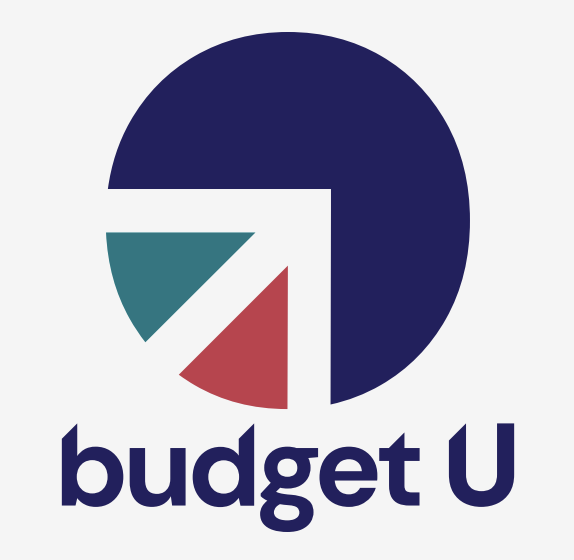
The primary logo paired this icon with stylized type. The logotype is a bold San Serif customization along the upper edge of the letterforms to continue the idea of upwards movement and growth.
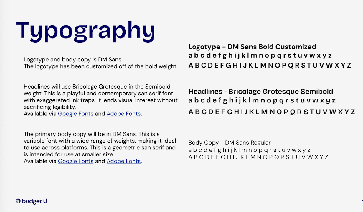
Typography
Typography across the brand uses a unique grotesque San Serif for headers and bold statements, and a supporting geometric San Serif to balance that out for most other copy.
Color Palette
We wanted to keep the colors bright and bold while maintaining the app’s accessibility. The primary color is True Blue, a deep blue that, when paired with a lighter Cobalt and Light Blue, creates a monochromatic palette. Each color in the brand palette has a deeper and lighter value to create a mini monochrome palette for each hue. This allows the colors to pair with each other within their own hues or with neutrals, while still meeting accessibility standards.
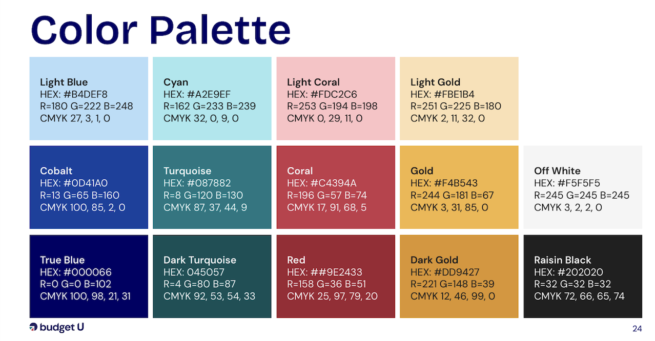
The main color choices were based on primary colors (red, blue, yellow) to evoke the app’s educational background, with the addition of turquoise to evoke a feeling of abundance with a hue that’s closely tied to US currency. The colors are a more muted than bright red or blue to give the palette a bit of elevation without feeling too aggressive.
Brand Messaging
When we began developing the messaging for Budget U, we were acutely aware that the brand needed a tagline that would further explain the name and appeal to college-age individuals as well as their parents.
Tagline
Based on our industry research, we knew that college students are craving autonomy, freedom, and easy-to-understand tools, while parents are seeking control and regulation over what they often feel is “uncontrollable spending,” without becoming the bad guy.
The tagline finalists included:
Know Your Budget, Own Your Life
Bring a Budget, Not Baggage
Finance, Finally on Your Terms
Budgeting on Your Terms
Budget Like You Mean It
Ultimately, we decided upon the following tagline, because it felt ownable by young adults, and appealing to parental goals.
“Build Your Budget, Own Your Life”
Vision and Mission
Since this was a first-to-market concept, our job with the vision and mission was not only to educate, but also to create a sense of urgency around the problem (College students don’t know how to budget and financially plan responsibly), and the solution (Get everyone on the same app in the family, so there is accountability).
Vision
Our goal is to be the premier financial budgeting platform that empowers young adults and families to confidently navigate financial decisions together, fostering honest, open, and stress-free conversations and decisions about money.
Mission
We strive to empower families and students to develop confidence and responsibility in managing money through straightforward budgeting, spending, and financial education.
Voice and Tone
Brand Voice
What we say about the brand.
Empowering: Encouraging students to own their financial future
Educational: Provides money, knowledge, and advice
Supportive: Acts as a partner to both students and parents
Easy & Clear: Simple to navigate, and function-focused.
Student-First: Prioritizing students’ growth, confidence, and independence
Trustworthy: A reliable tool for families
Responsible: Promotes smart financial behavior and planning
Forward-Thinking: Using the latest technology to focus on long-term success
Inclusive: Accessible to all students, regardless of background
Problem Solver: Helping families to navigate finances
Collaborative: Working with parents, students, and colleges to navigate finances
Brand Tone
How we say it.
Confident: Knowing their value and communicating it clearly
Warm: Helpful and non-judgmental
Empathetic: Understanding this is a delicate subject for some people
Lightly Rebellious: Breaks norms in a smart way, relating to a student audience
Smart: Informed, clever, and practical
Reassuring: Reducing stress around financial conversations
Relatable: Speaking the language of families and students
Approachable: Easy to engage with and friendly
Straightforward: No nonsense, straight to the point
Supportive: Offering guidance, NOT lecturing
And with that, Budget U came to life.
After initial testing, the founders realized their original concept needed to expand beyond its focus. While it resonated with college students and their parents, it became clear that there was an underlying need to build better money habits that started much earlier and extended across the household.
In response, the founders reimagined the product as a broader budgeting and financial-tracking tool for families as a whole. This shift opened the door to supporting pre-teens, teens, and parents within a single platform, enabling financial education, transparency, and collaboration at every stage of life.
This shift called for a rebrand. Budget U no longer reflected the broader, family-focused vision, so it was time for a full refresh. A new name, logo, messaging, and visual identity were needed.
In part two of this blog, we’ll explore how this rebrand took shape.
Are You In Need of a Refresh?
Recognizing that your brand needs to evolve can feel daunting, but a rebrand doesn’t have to mean starting from scratch. Often, it’s about refining what’s already there. That might mean updating your messaging to better connect with a new audience or refreshing your visuals to better align with where your business is today.
At Summary Content Marketing, we’ve spent 10+ years helping brands grow, adapt, and tell their stories more effectively. Whether you need a subtle shift or a full transformation, we’re here to guide the process and bring your brand to life.
If you’re ready to take the next step, get in touch with us today.
W